Back to Home
Hope Church
The Challenge
Hope Church had grown rapidly over several years, but its existing website no longer reflected the church’s identity. Key problems included:
- Outdated visual design
- Difficult mobile navigation
- Low first-time visitor conversion
- Poor sermon discoverability
- Lack of centralized ministry information
- Weak online giving experience
- Inconsistent branding across digital channels
Leadership identified that the website was functioning as an information archive rather than a ministry tool. The new objective was to create a platform that:
- Welcomed first-time visitors
- Simplified next steps
- Increased online engagement
- Reflected the church’s energy and culture
- Supported growth at scale
Discovery and Research Phase
The design process stemmed from identifying Hope Church’s primary digital audiences:
- First-time visitors, with people asking understandable questions like what to expect, what to wear, where to park, how does childcare work, etc. This audience became the highest-priority conversion path.
- Returning attendees who need fast access to service times, event registration, sermon archives, the giving portal, and ministry updates.
- Online community, such as users engaging remotely through livestreams, message playback, prayer requests, and digital discipleship resources.
Strategic UX Decisions
Common high-performing traits for digital patterns and engagement architecture, including inspiration from large-scale contemporary church experiences included:
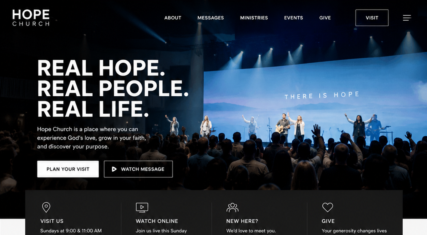
- Cinematic hero imagery
- Minimal top-level navigation
- Strong “Plan Your Visit” emphasis
- Immediate service-time visibility
- Large, emotional messaging
- Modular ministry pathways
- Strong media integration
The homepage opens with: “REAL HOPE. REAL PEOPLE. REAL LIFE.” This messaging was intentionally designed to communicate welcomeness, authenticity, and transformation. Church websites often overuse internal language unfamiliar to visitors. The chosen copy avoids church jargon and speaks directly to newcomers.